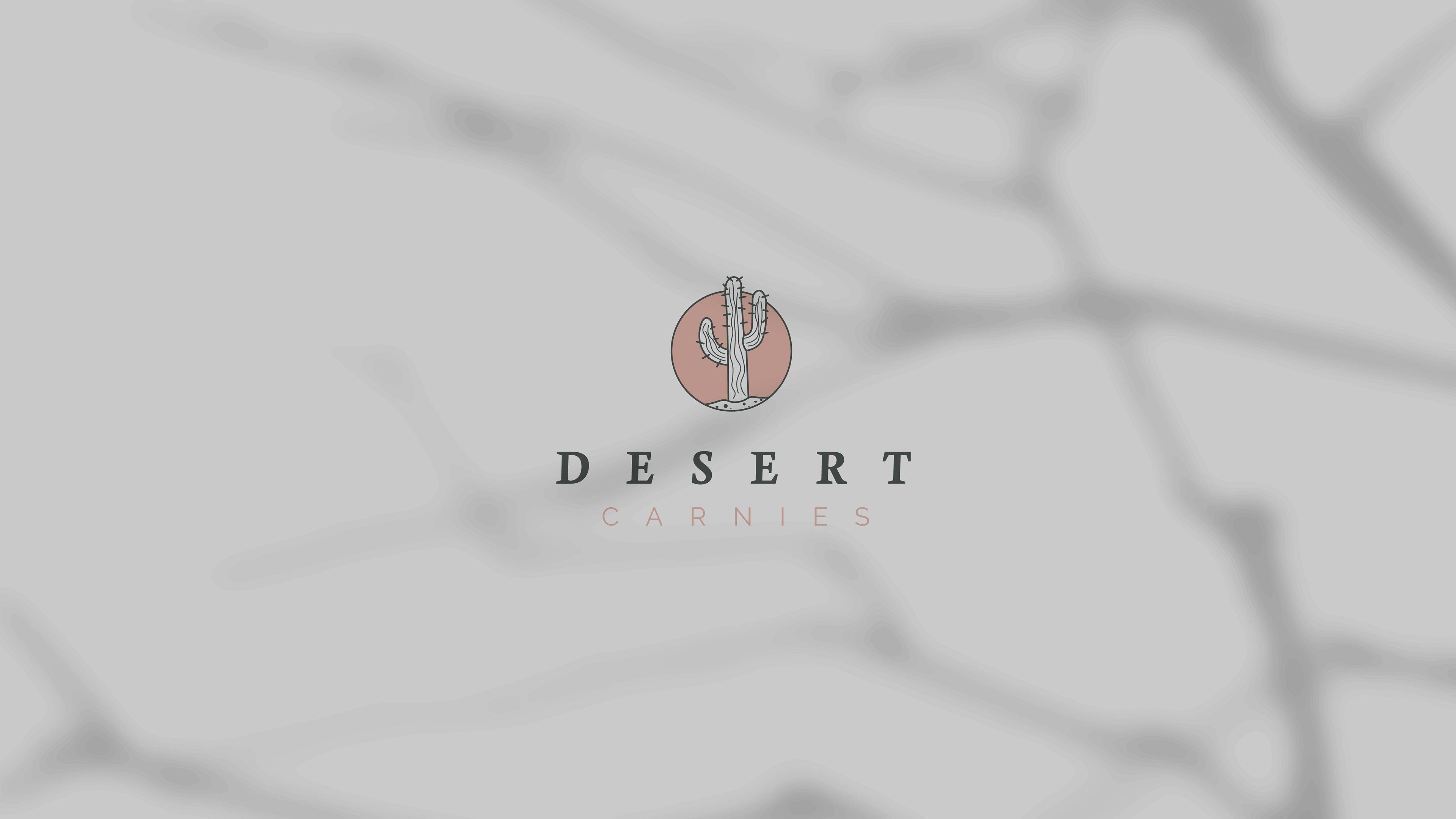
Desert Carnies
A logo design I did when asked for the burning man festival, drawn from inspiration from the book built to burn.
A logo design I did when asked for the burning man festival, drawn from inspiration from the book built to burn.
Wezank
I developed this motion graphics, together with Wezank.
I conceptualised the visual narrative, creating the storyboarding from initial idea to final execution. I further supported on copywriting and overseeing the creative process. Giving guidance on the motion graphics, trying to capture a harmonious flow.
Programmatic Boost
I created a logo for a new hiring product within Pandologic's integration system. This product was designed as a potential replacement for LinkedIn, targeting professionals and businesses in the hiring and recruitment industry.
The logo needed to resonate with the target audience by evoking a sense of familiarity while establishing the sub-brand as innovative and forward-thinking.


Sluiper
A logo design for an outdoor gear and apparel brand. The brand caters to adventure seekers, wildlife enthusiasts and modern explorers who value a deep connection with nature.
The name Sluiper is derived from the Dutch word, meaning stalker or prowler. I tried to stay true to the brand essence, reflecting an edgy and bold aesthetic yet grounded in simplicity and stilness.
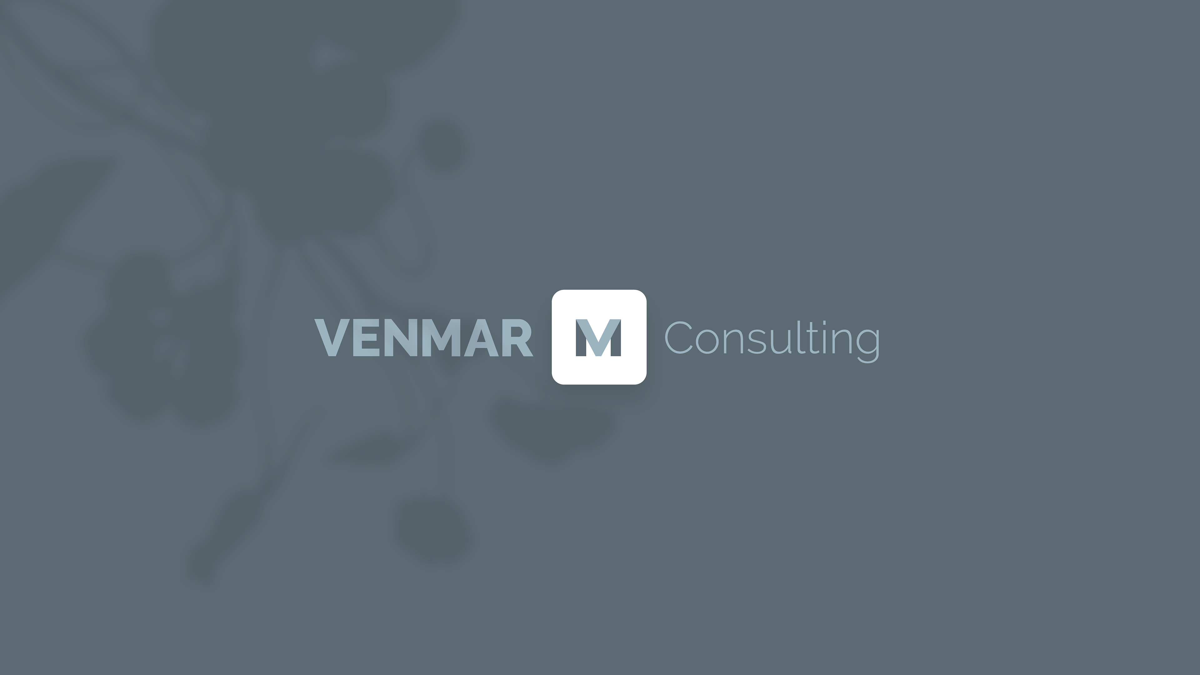
Venmar
Venmar is an independent consultant specializing in health communication, policy, research and strategy.
I helped in branding and creating a website to get him started. I tried to reflect professionalism and reliability by a calm and bold approach.
Venmar is an independent consultant specializing in health communication, policy, research and strategy.
I helped in branding and creating a website to get him started. I tried to reflect professionalism and reliability by a calm and bold approach.
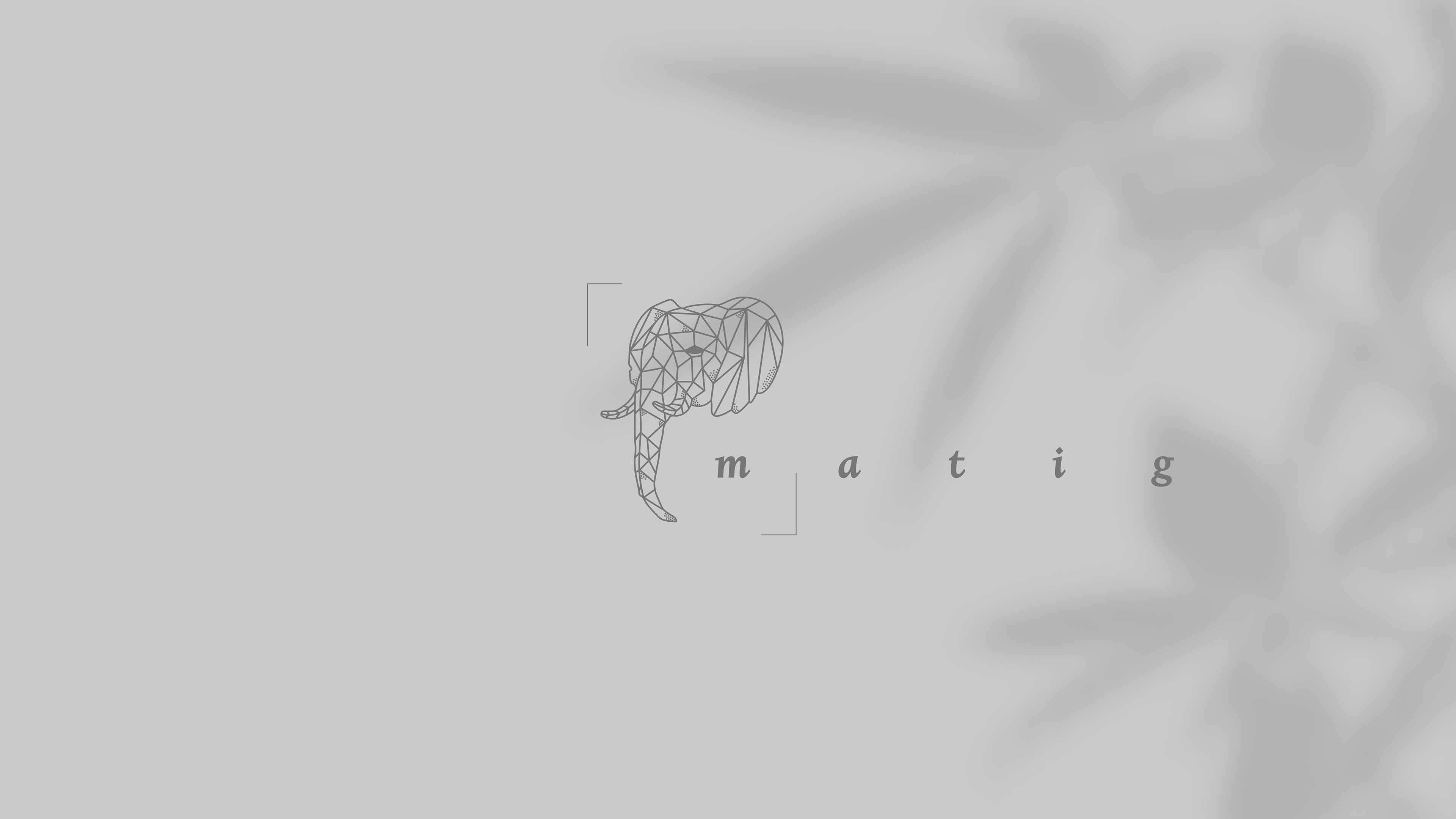
Matig
I designed a fun and artsy logo for another startup. Focused on eco-consciousness and creative innovation.
I tried designing the logo keeping the brand's ethos of living in harmony with nature, without excess or waste, in mind. I incorporated an elephant, a symbol of wisdom, strength and environmental consciousness.
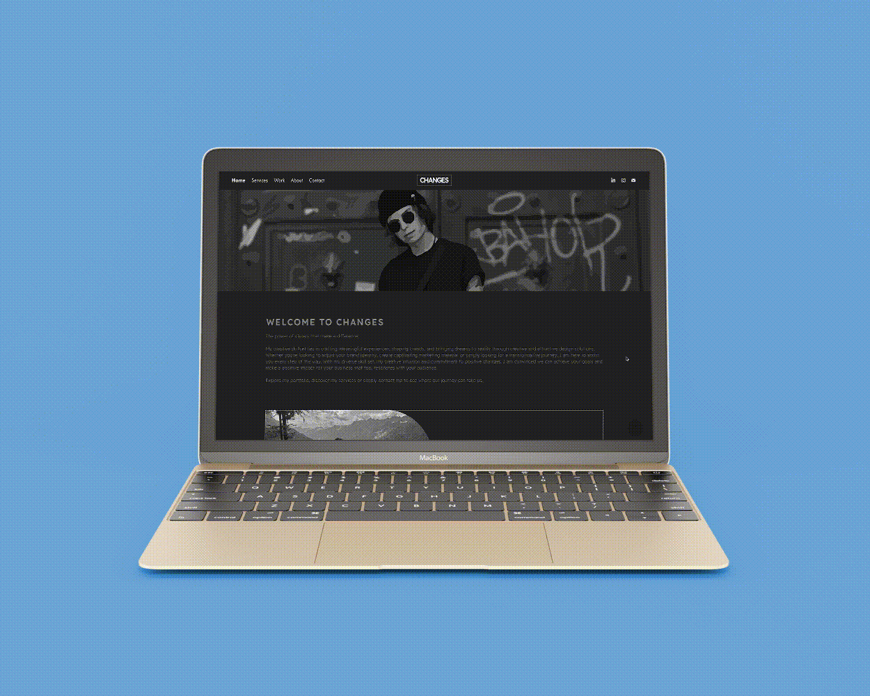
Studio Changes
Back into freelance design, I worked on a different website and personal branding. Showcasing my skills en provide services to easier connect with potential clients.
Back into freelance design, I worked on a different website and personal branding. Showcasing my skills en provide services to easier connect with potential clients.
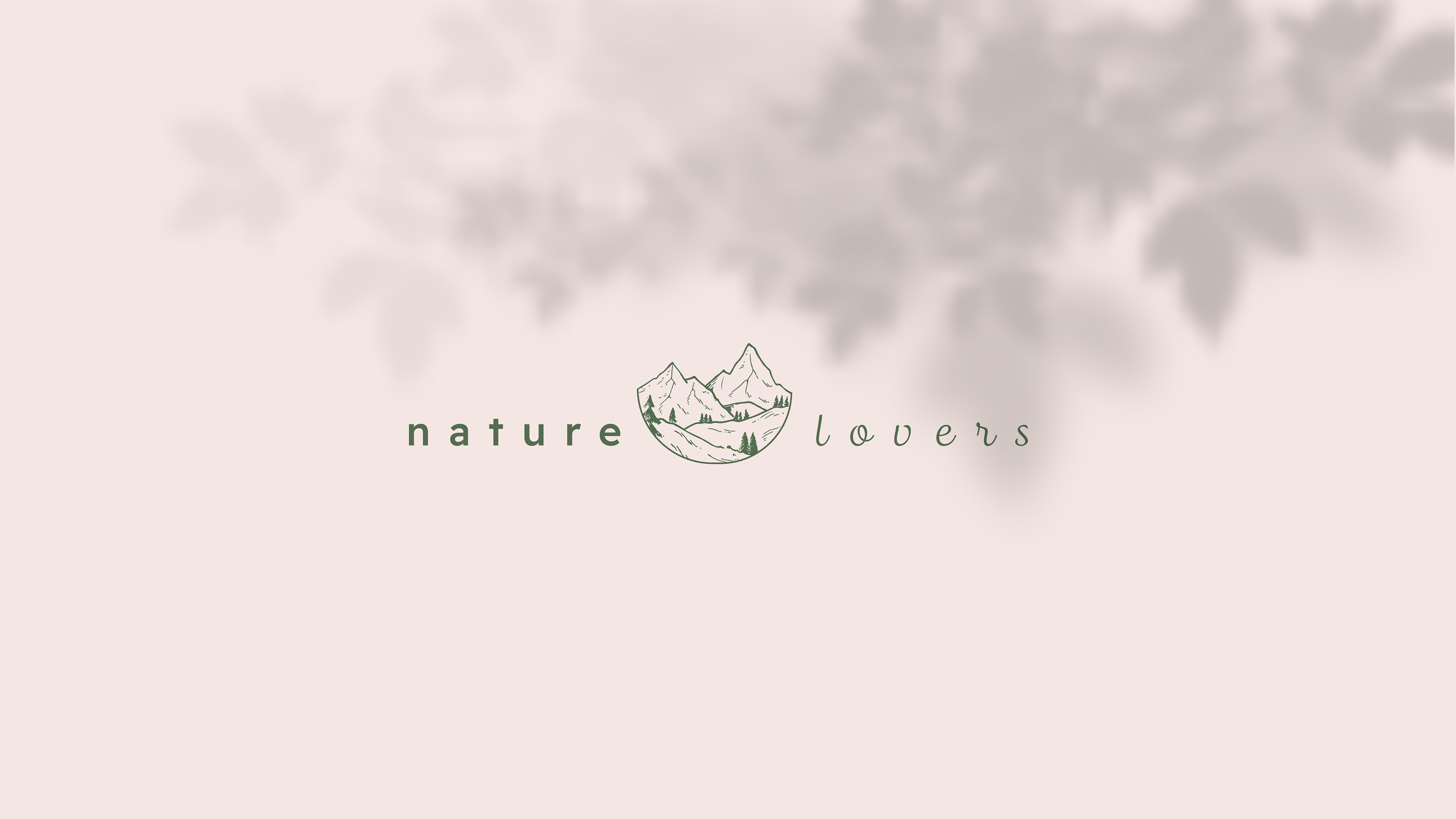
Nature Lovers
Another fun and artsy logo for a a group that's passionate about the natural world. A community that unites people who cherish, protect and advocate for nature, encourage sustainable living and environmental care.
I tried to capture this deep love for nature, reflecting the community's commitment to preserving the earth's beauty and its resources by keeping a balanced and peaceful design.
Social Media Ads
Besides website I also created social media profiles and promotional material. The goal was to create a messaging that not only showcased my versatility as a creative professional but also established an personal connection by keeping it authentic and relatable.

Delta Mantra
A Thailand-based organisation dedicated to the protection and well-being of elephants in need. Their mission is to rescue, rehabilitate and ensure a safe habitat for elephants.
The organisation sought a modern, smart and compact logo design that effectively represented their core values and could be easily recognised across various platforms and mediums. I incorporated the initials DM into an elephant icon.
GV
An animation for landing page design and used for introduction of videos.
An animation for landing page design and used for introduction of videos.

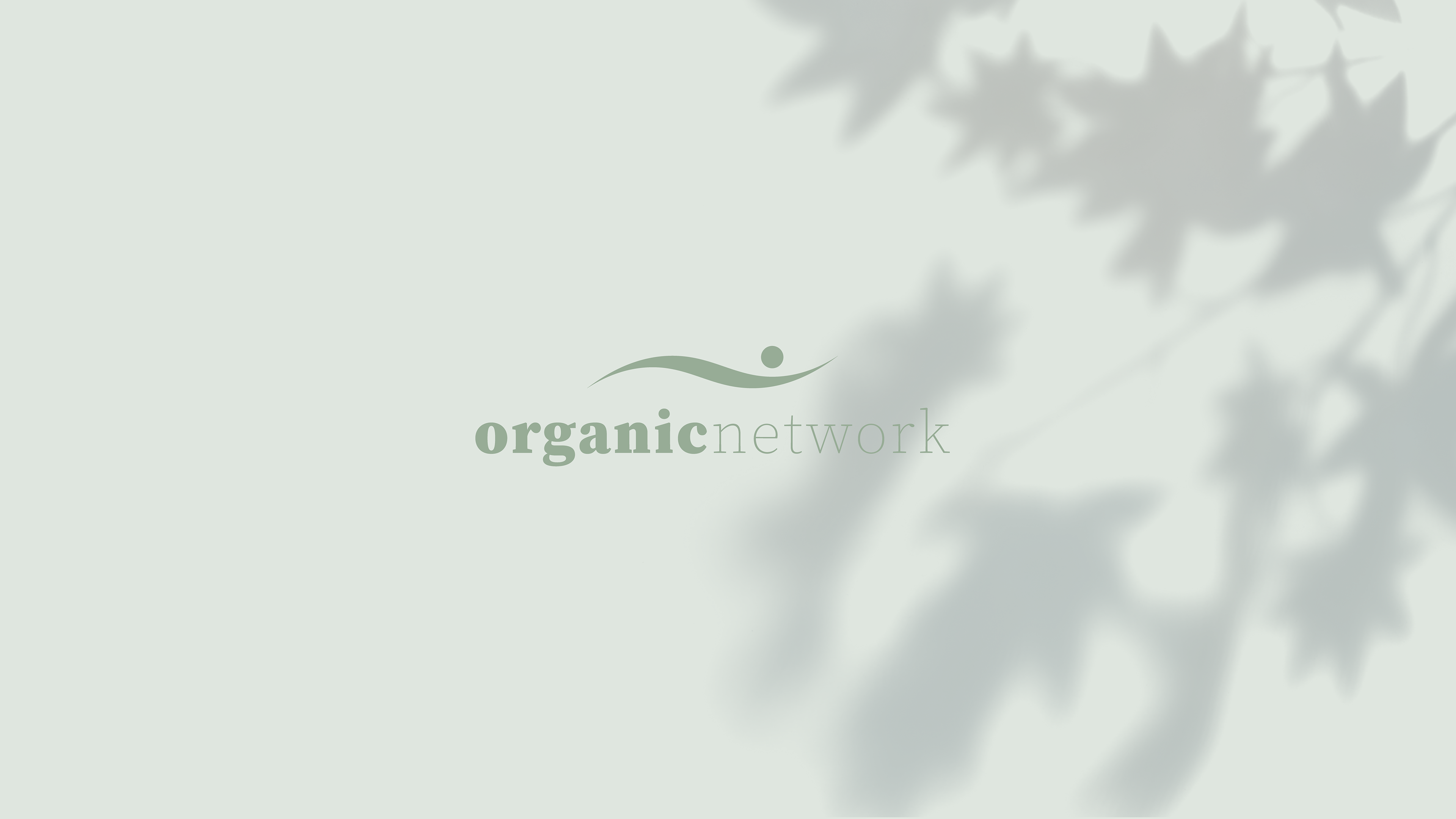
Organic Network
Organic Network is an online platform dedicated to connecting job seekers with opportunities in the organic and sustainable industries.
For the logo design, I tried to communicate this platforms focus. Still keeping it professional yet approachable. Incorporating an icon and typography that reflects the platform's role as a trusted connector within the organic industry.
CTM
Click Talk Marketing is a service-oriented brand dedicated to helping businesses optimise their digital marketing strategies.
I worked on creating their brand identity. They wanted to have a playful, midly cartoonish style yet straightforward, no-nonsense, result-driven ethos.
Click Talk Marketing is a service-oriented brand dedicated to helping businesses optimise their digital marketing strategies.
I worked on creating their brand identity. They wanted to have a playful, midly cartoonish style yet straightforward, no-nonsense, result-driven ethos.


Hiking
A simplistic art project, capturing the serenity of the solo hike.
A simplistic art project, capturing the serenity of the solo hike.
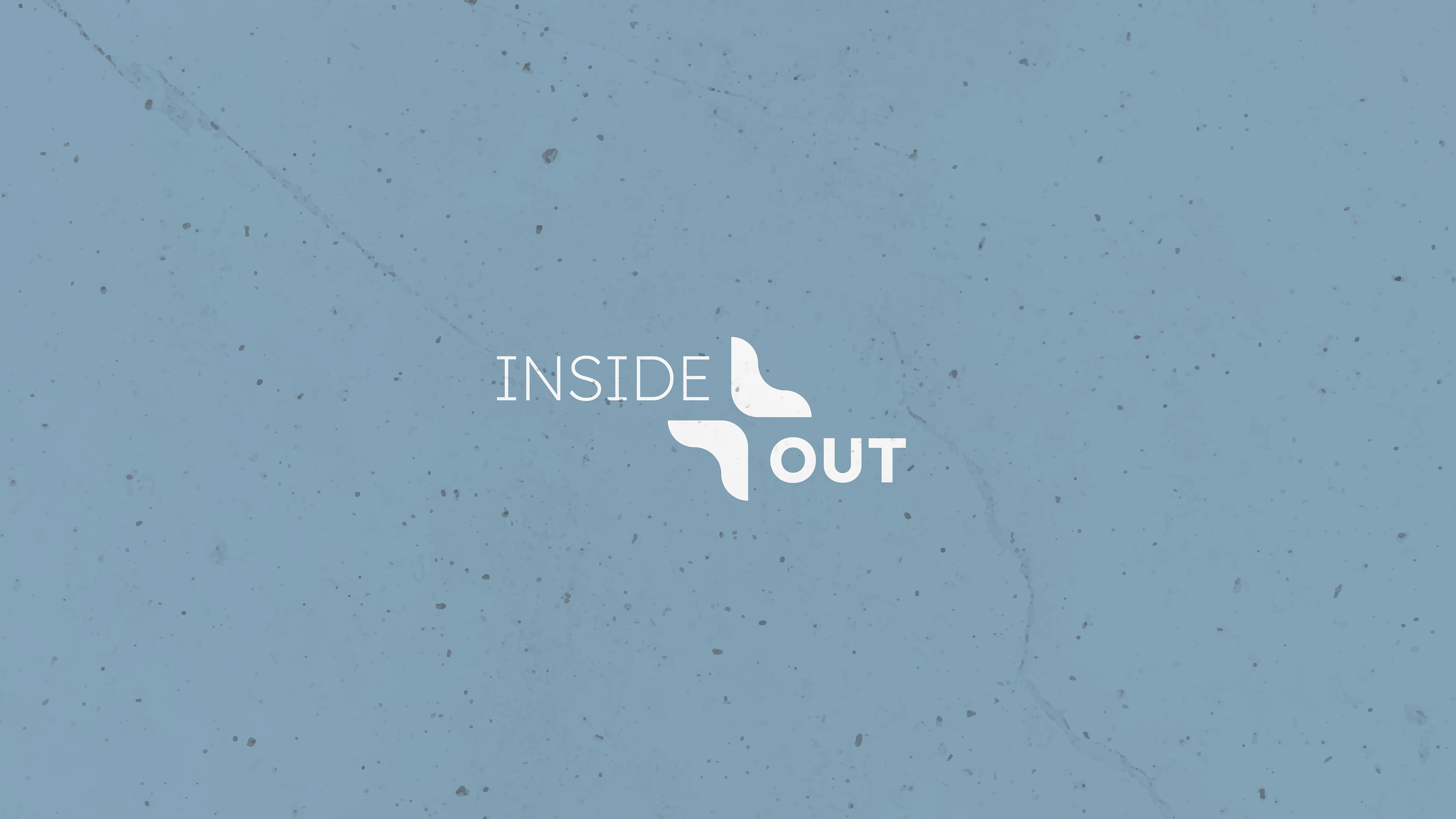
Inside Out
An innovative climbing brand catering to daring adventurers.
I designed the logo with the intent of reflecting the duality of the climbing experience. Highlighting this journey in the design choices, clean and elegant to loud and bold. Embracing this inner piece of the experience and intense physicality of the sports.
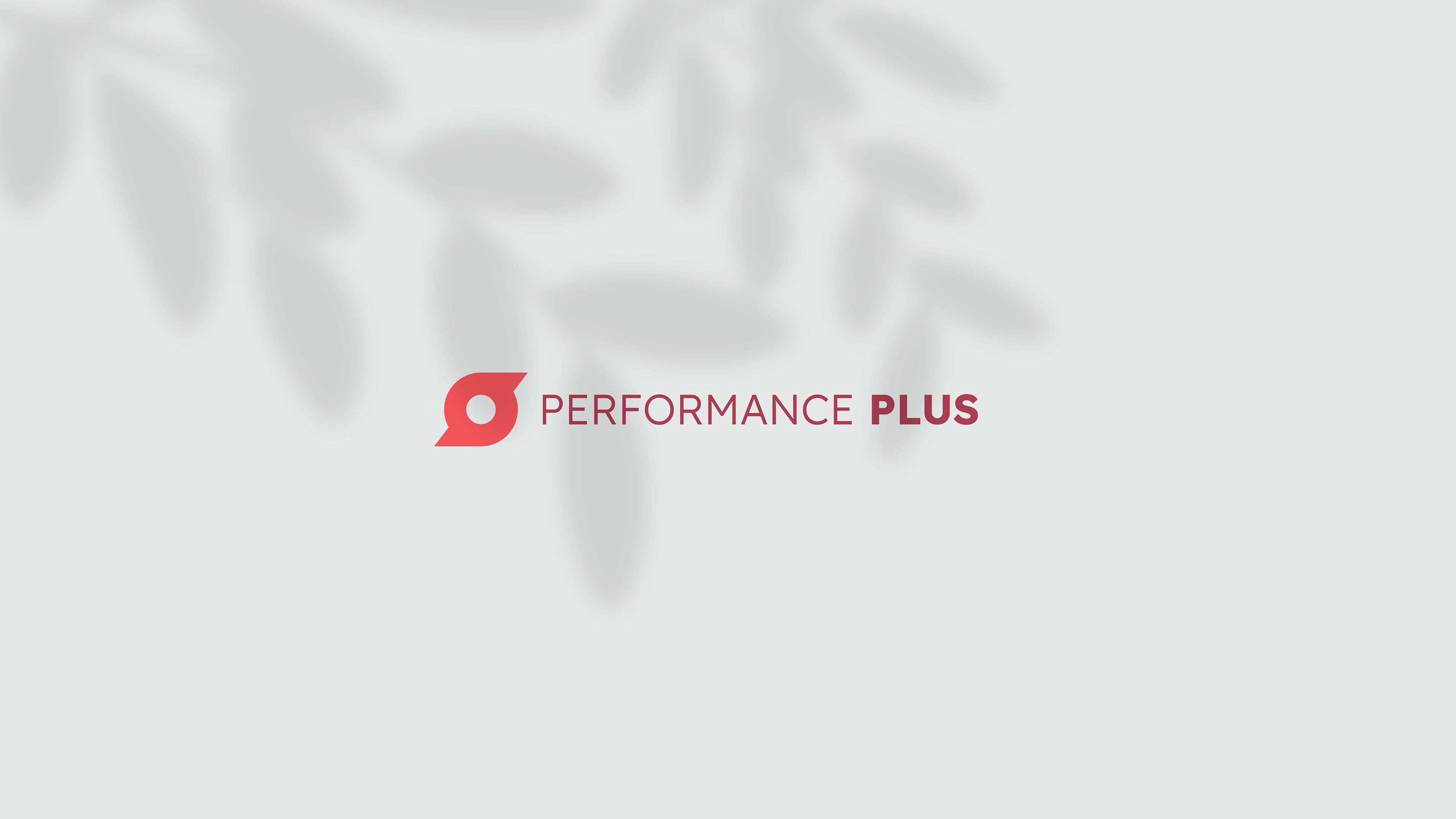
Performance Plus
A logo design for a new job platform that connect individuals with high-impact career opportunities across various industries.
The goal was to design a logo that visually communicated power, motivation and strength. I tried to capture a sense of energy and momentum to align with the platform’s focus.
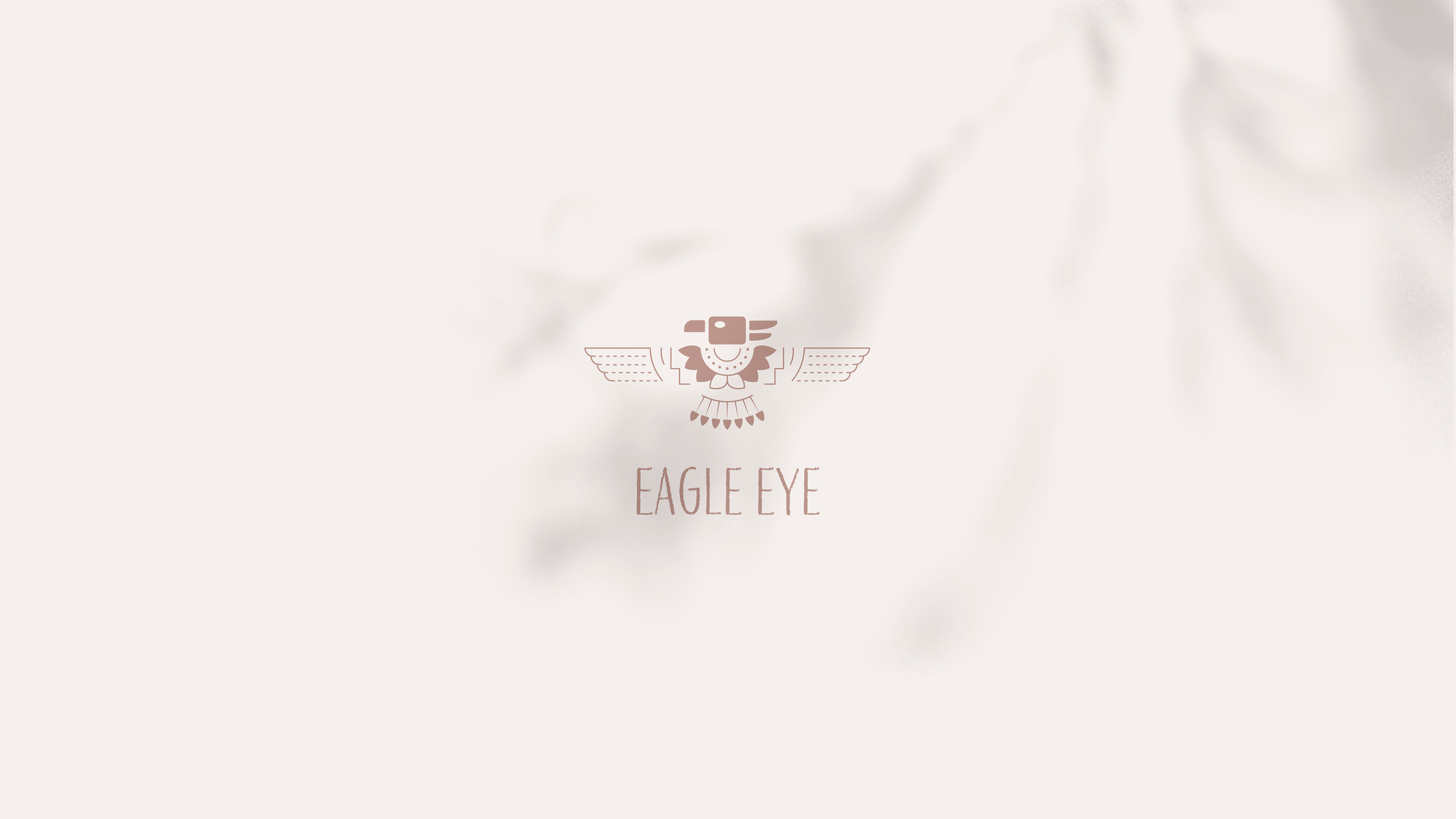
Eagle Eye
An artsy logo I once designed for no reason. Well, actually originated from a tattoo design I once did and I created a logo out of it ;)
An artsy logo I once designed for no reason. Well, actually originated from a tattoo design I once did and I created a logo out of it ;)
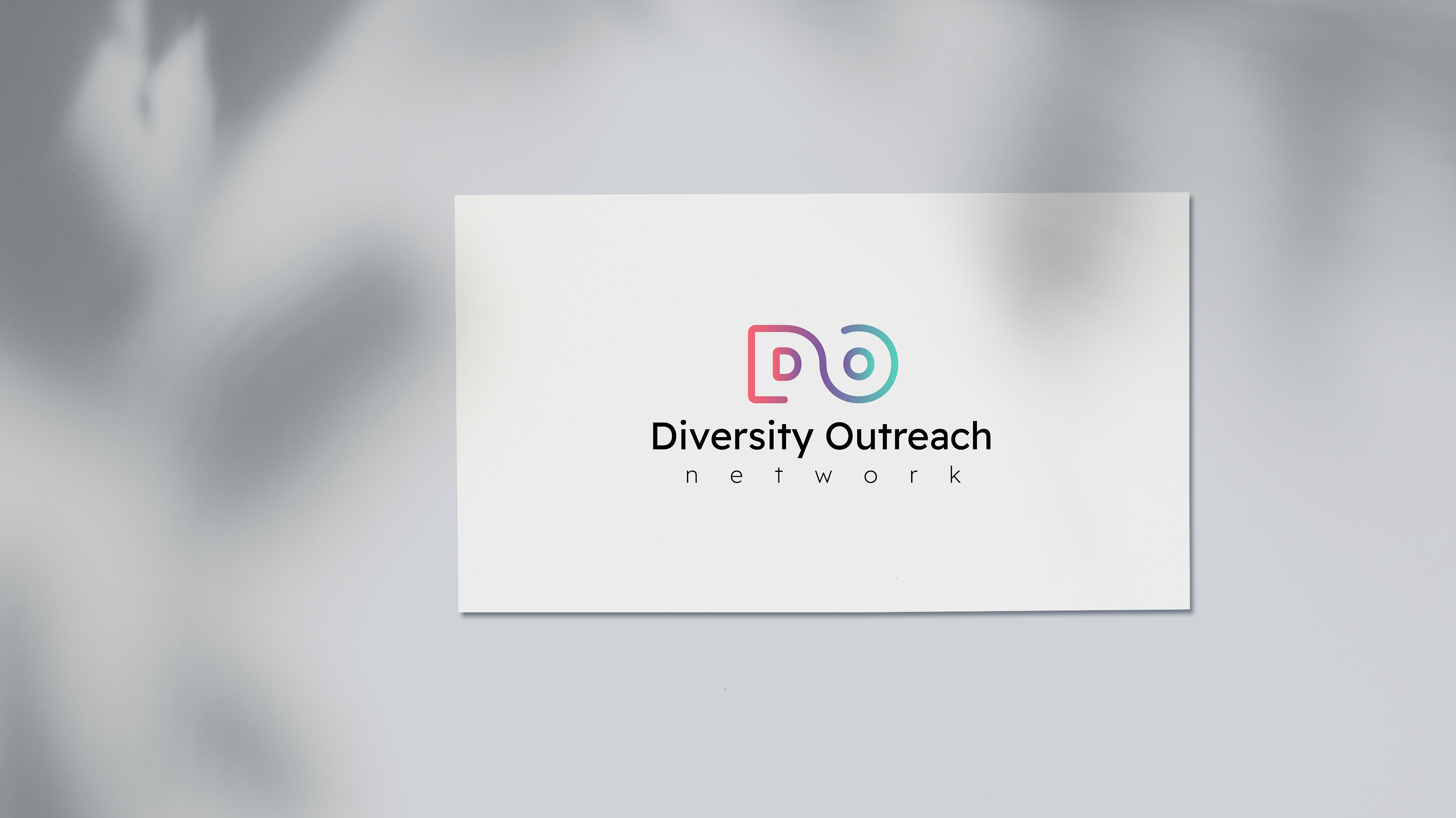
DON
The Diversity Outreach Network is a recruitment platform dedicated to promoting and enhancing diversity in the workplace.
I tried to depict unity and inclusion trough the connected flow of the initials and overlaying colouring.
The Diversity Outreach Network is a recruitment platform dedicated to promoting and enhancing diversity in the workplace.
I tried to depict unity and inclusion trough the connected flow of the initials and overlaying colouring.
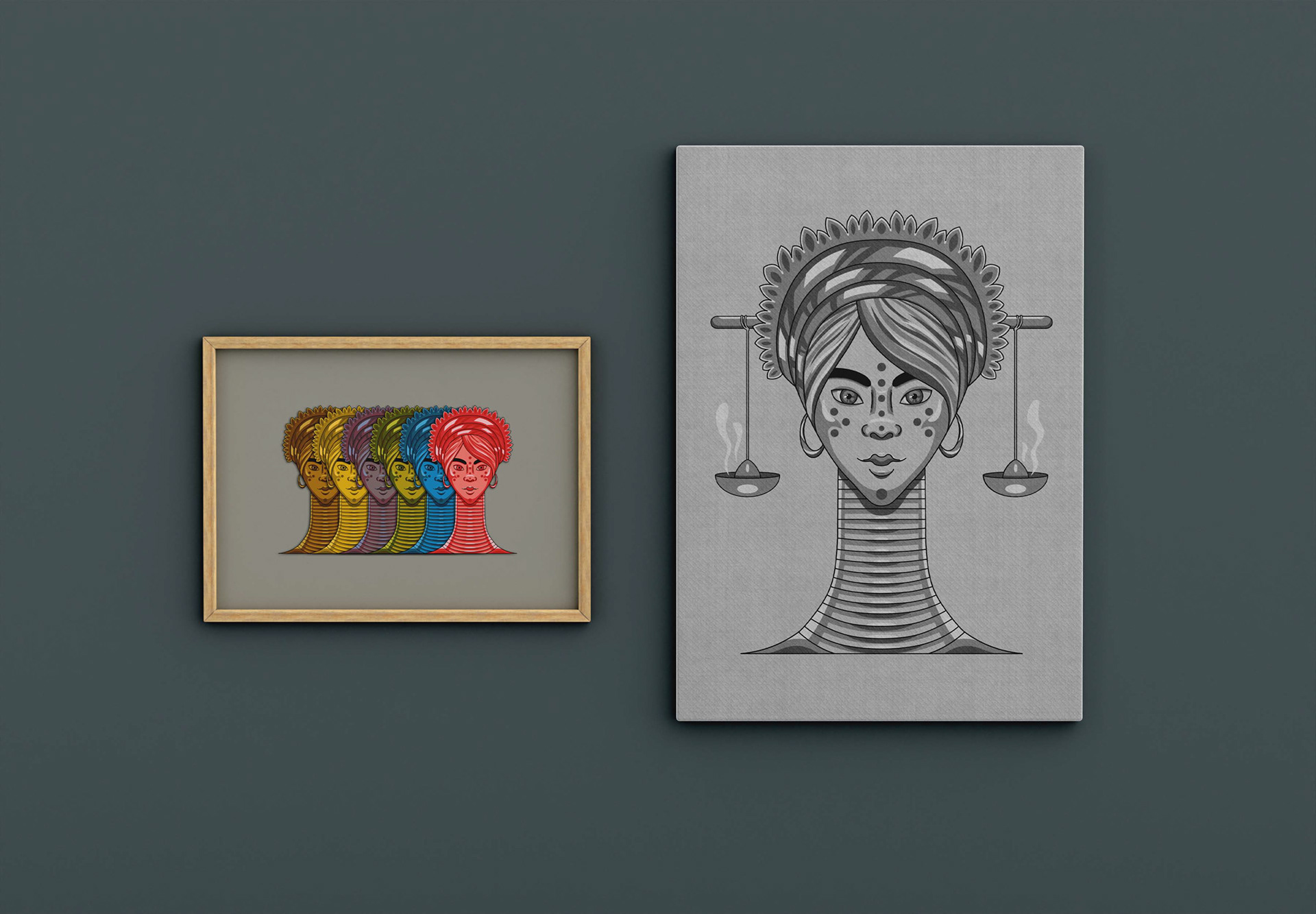
Longneck
This art project got inspired by my visit to the Longneck village in Thailand. Celebrating the beauty of culture.
This art project got inspired by my visit to the Longneck village in Thailand. Celebrating the beauty of culture.
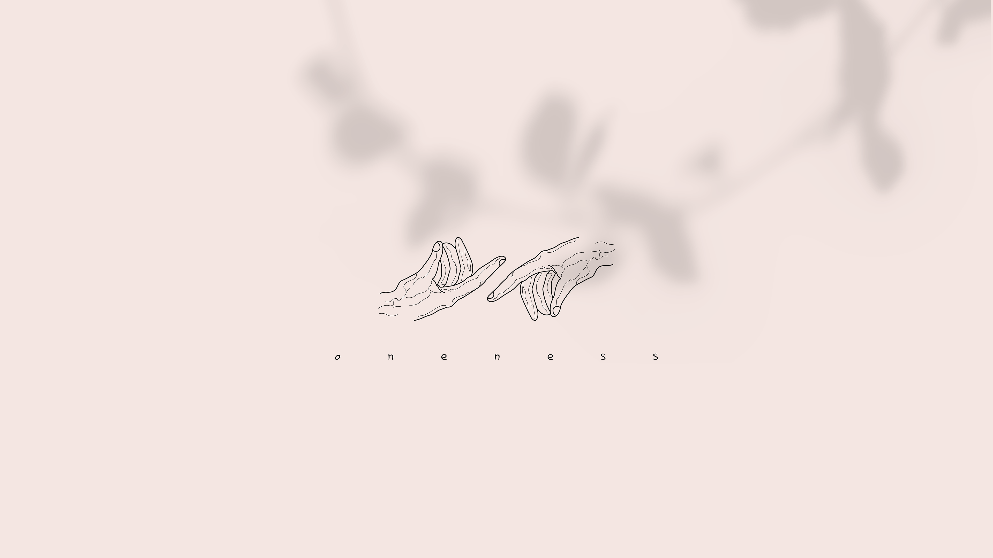
Oneness
Inspired by a profound spiritual journey. Symbolising unity, peace and wisdom in a balanced design.
Inspired by a profound spiritual journey. Symbolising unity, peace and wisdom in a balanced design.
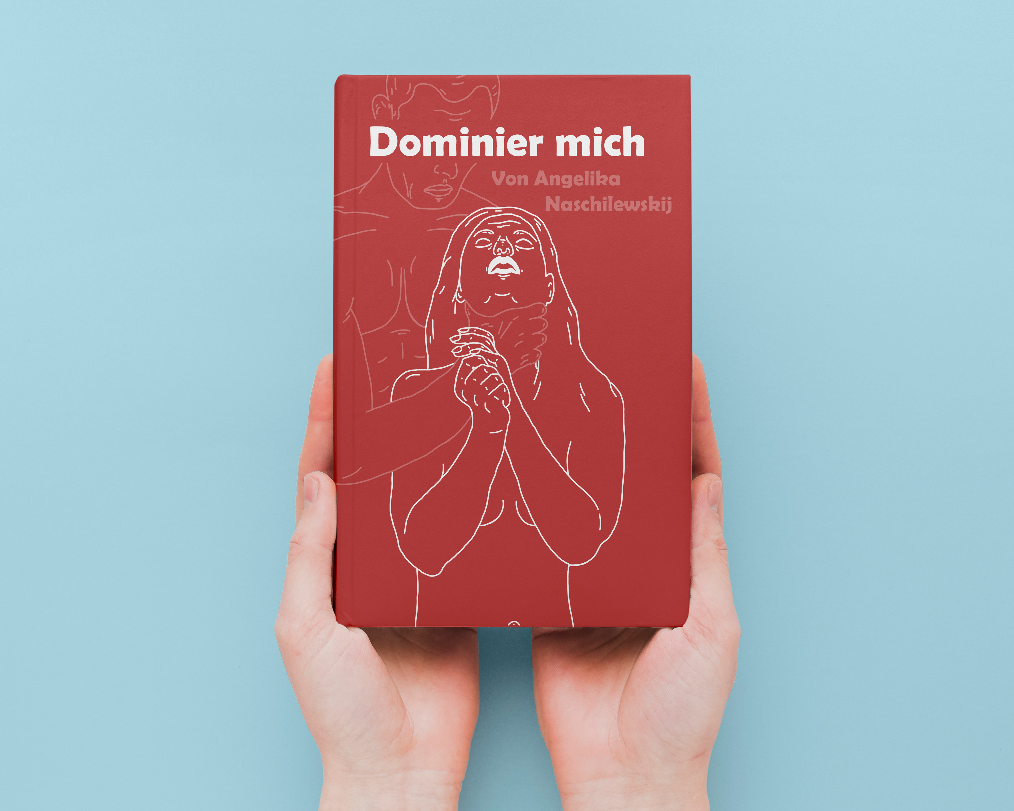
Dominier Mich
A book cover design for a friend.
A book cover design for a friend.
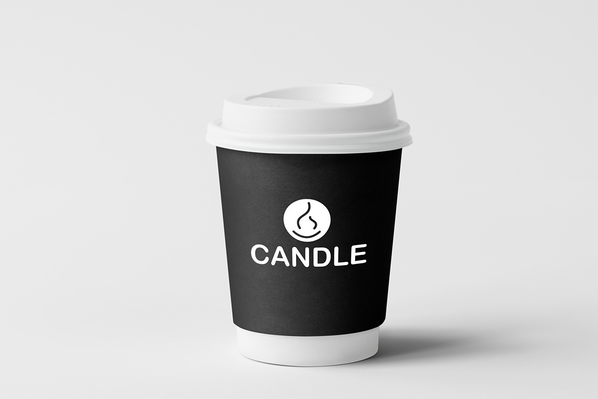
Candle
One of my first branding projects for a modern coffee shop. Focused on a clean and contemporary aesthetic.
One of my first branding projects for a modern coffee shop. Focused on a clean and contemporary aesthetic.
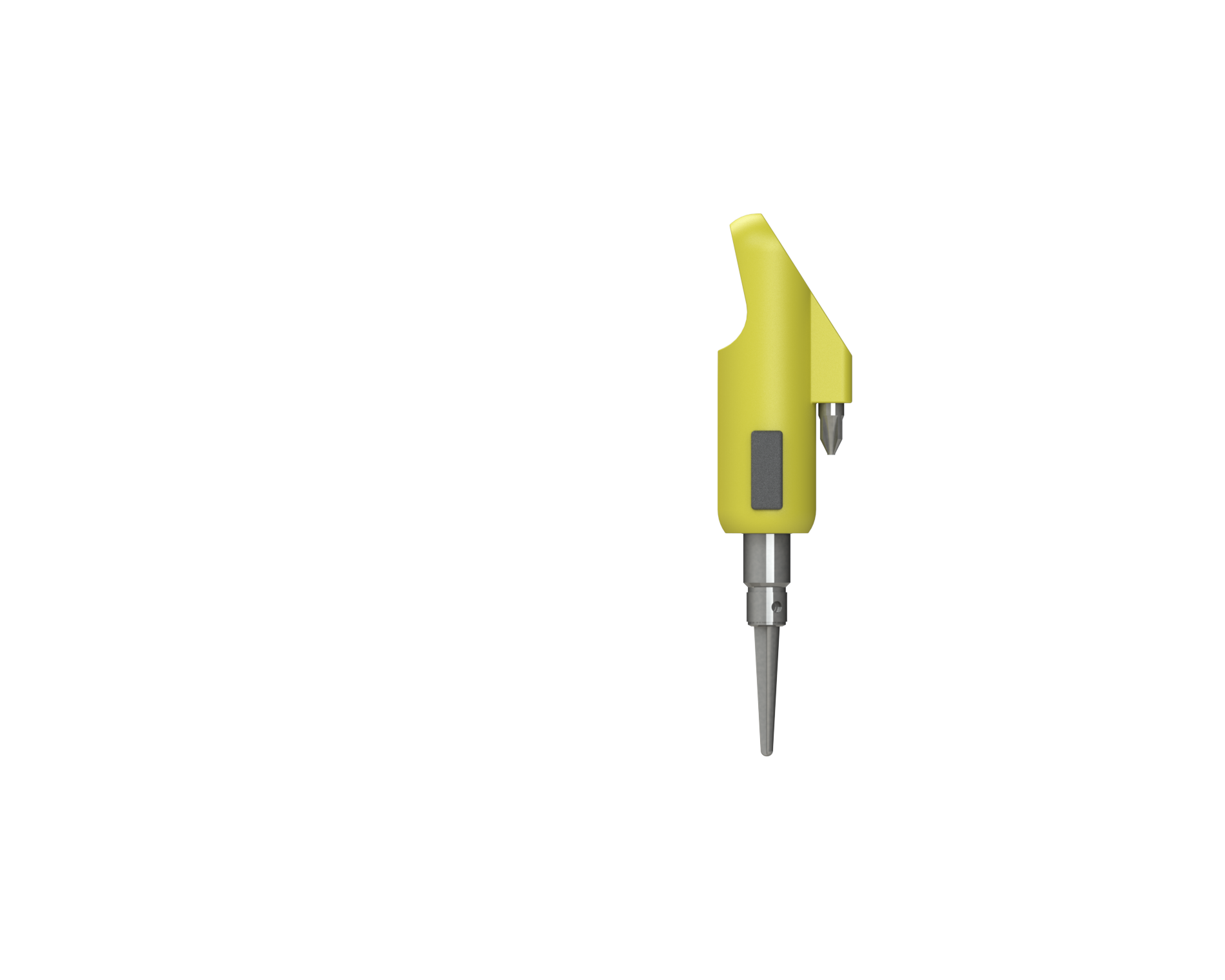
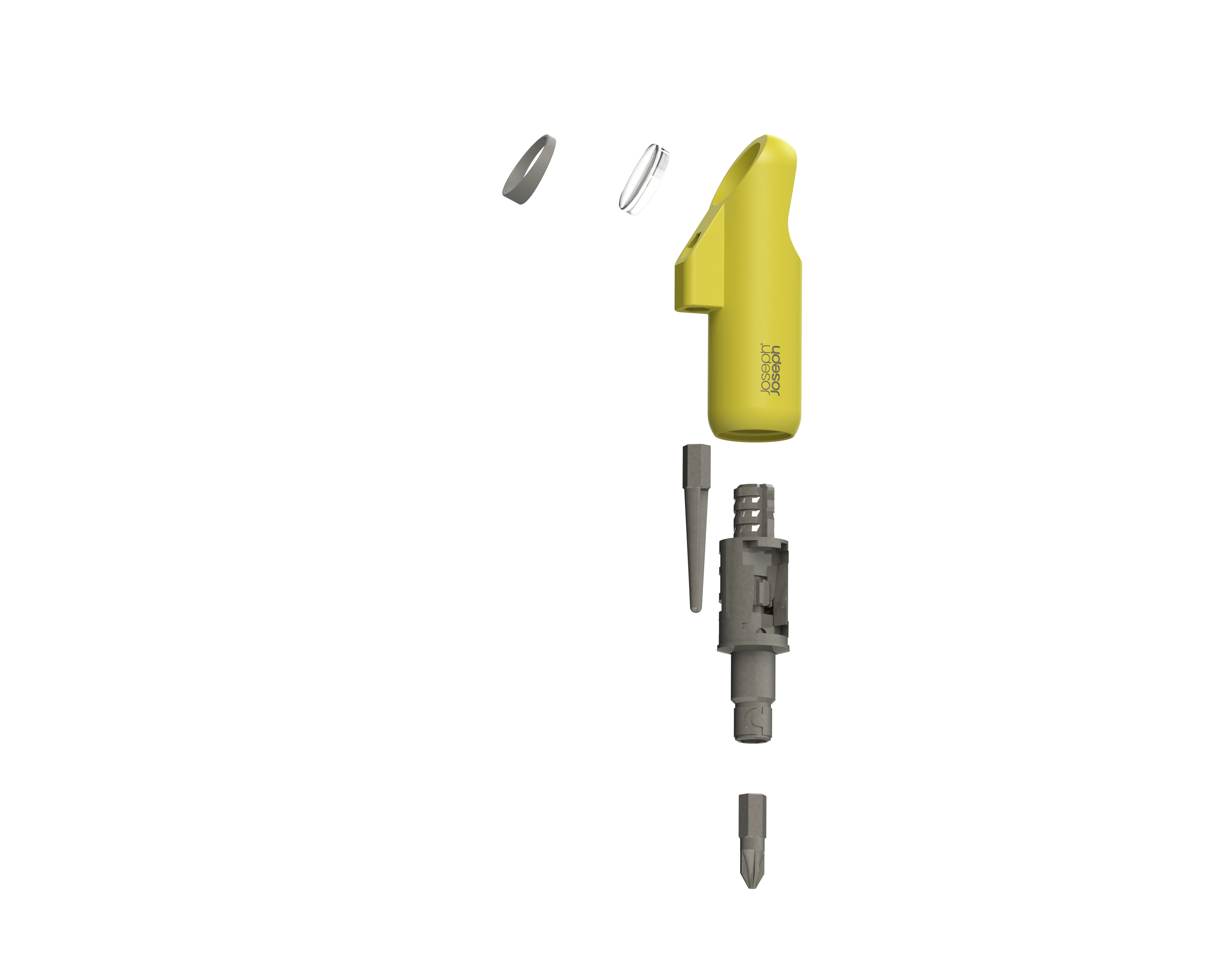
JosephJoseph
A project I did in my studies I'm pretty satisfied with, still to this day.
Product development of a multitool, used for sailers. Equipped with a magnifying glass, crosshead and knife. For maintenance and survival scenarios. Designed to be compact, durable and easy to use. Name originated from it's design, looking like a little figure with a backpack.


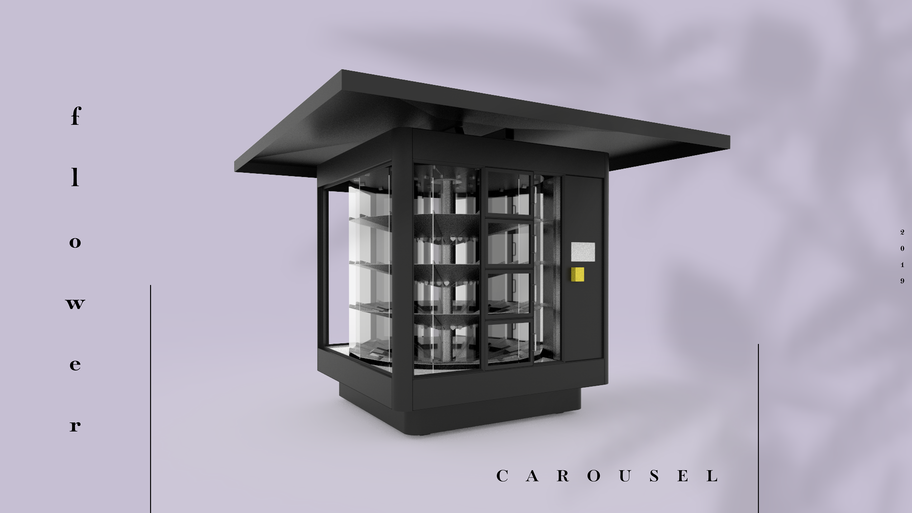
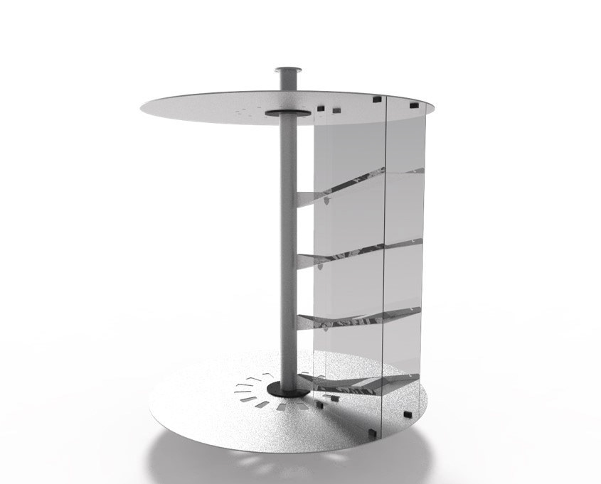
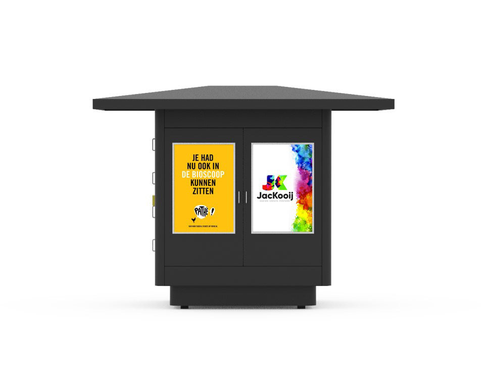
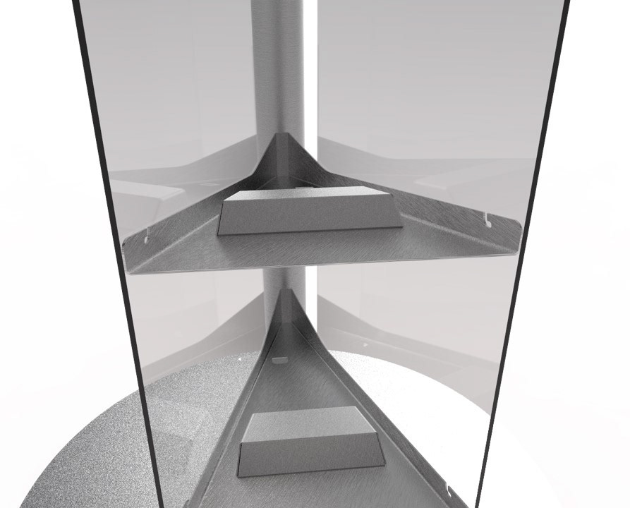
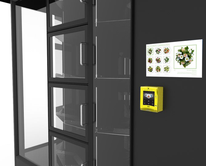
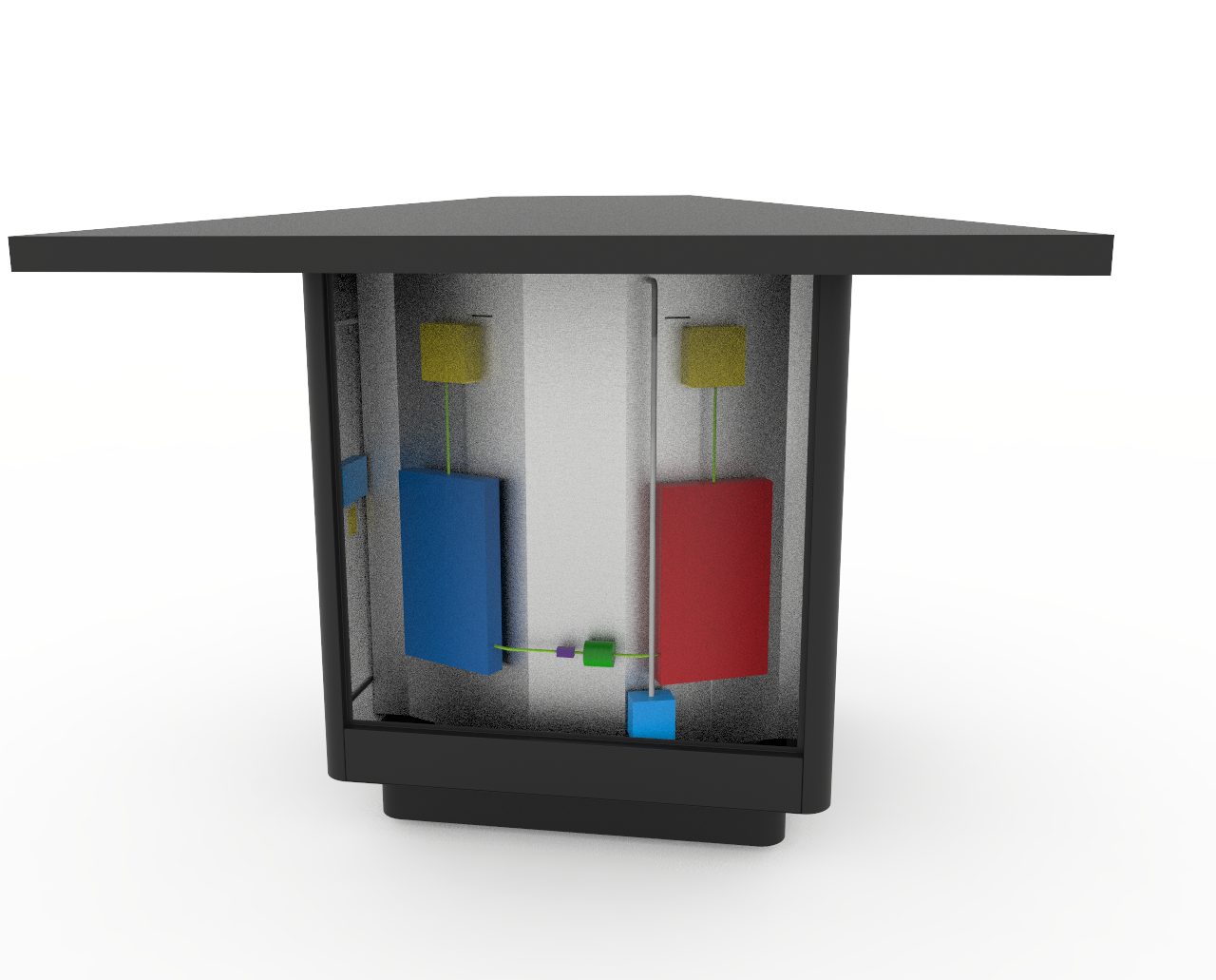
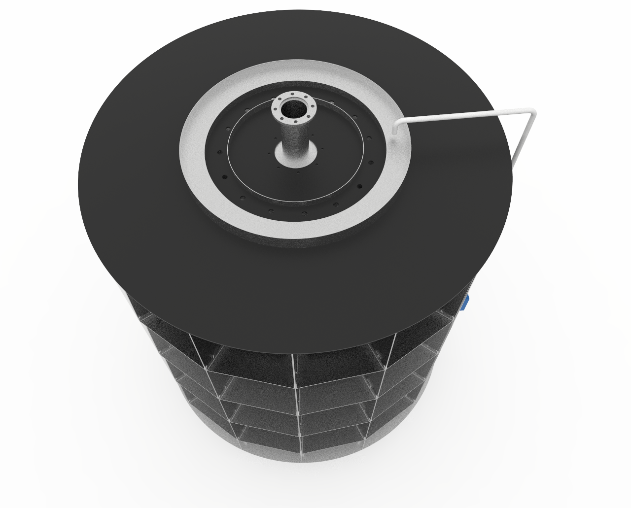
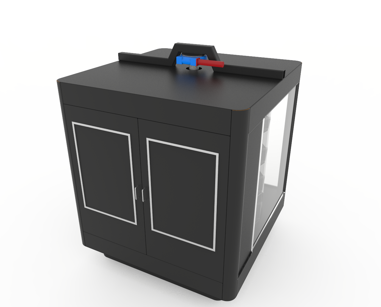
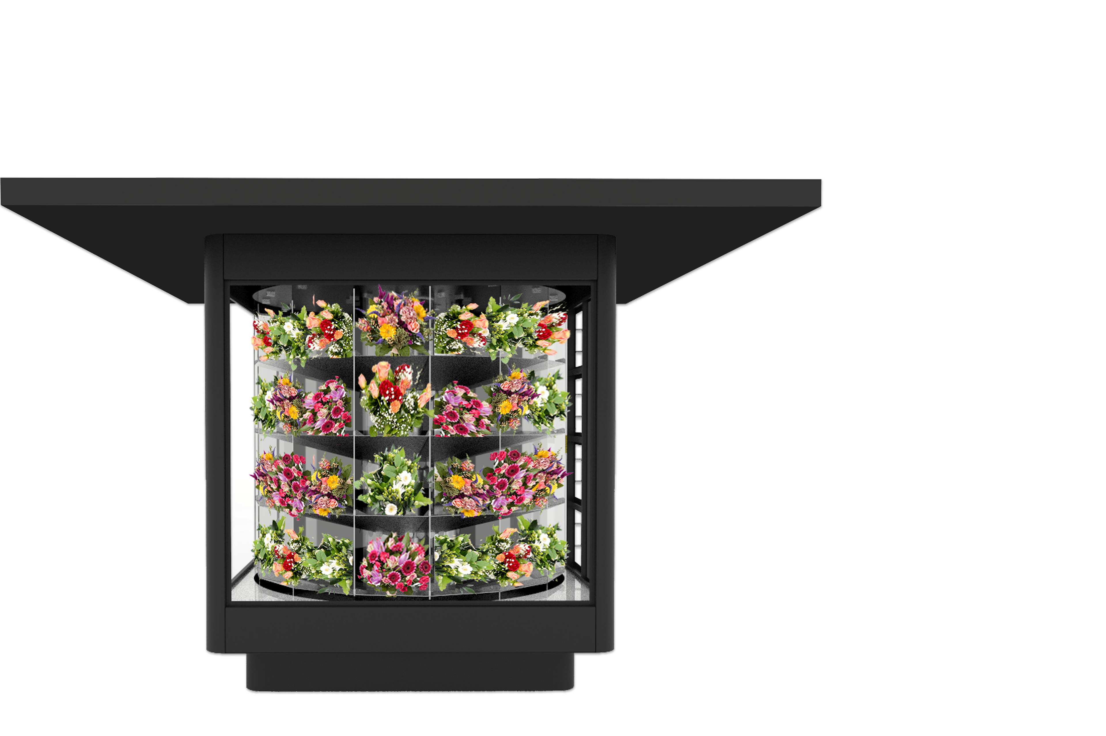
JacKooij BV
Another project I did in my studies I'm pretty satisfied with and got selected.
A redesign project for a flower carousel of the 1990s. The goal was to modernise. Focusing on ergonomics, sustainability, functionality, cost and aesthetics.
Another project I did in my studies I'm pretty satisfied with and got selected.
A redesign project for a flower carousel of the 1990s. The goal was to modernise. Focusing on ergonomics, sustainability, functionality, cost and aesthetics.